

Following Werdmuller Centre and Other Works in 2010 Mozambican-born artist, Ângela Ferreira recently showed her second solo exhibition at Stevenson in Cape Town. Investigating the ongoing impact of colonialism and post-colonialism on contemporary society her work takes on a research-based practice which is translated through various media. The exhibition consisted of two parts: Carlos Cardoso – Straight to the Point in commemoration of one of Mozambique’s most renowned investigative journalists and an audio-sculptural piece, Peter Blum – Kaapse Sonnette/Cape Sonnets, which focuses on links between South Africa and Austria through the Afrikaans poet Peter Blum.
 |
|
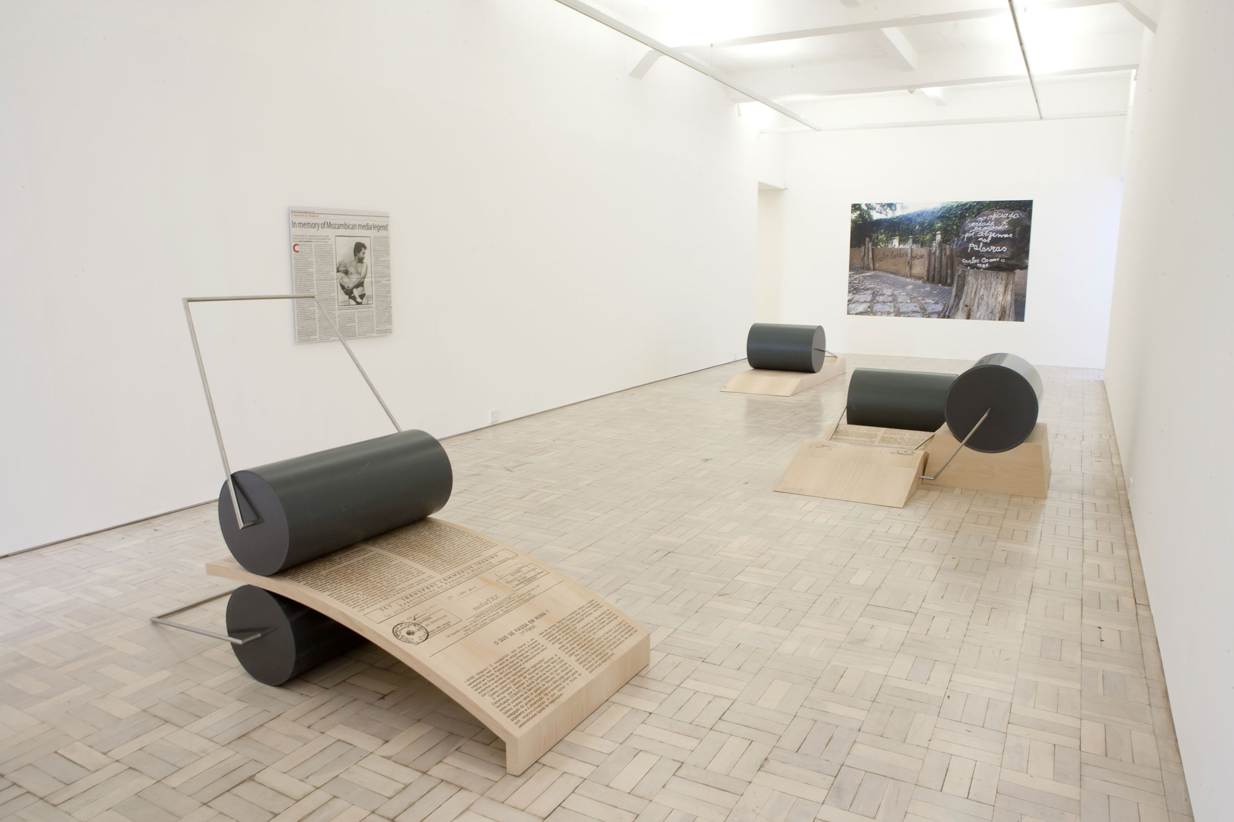
Installation view of Carlos Cardoso – Straight to the Point
|
Carlos Cardoso – Straight to the Point was inspired by an article titled “In memory of Mozambican media legend” which appeared in the Mail & Guardian last year. What exactly was it about this article that motivated you to dedicate an entire show in tribute of Cardoso’s life and work?
 |
|
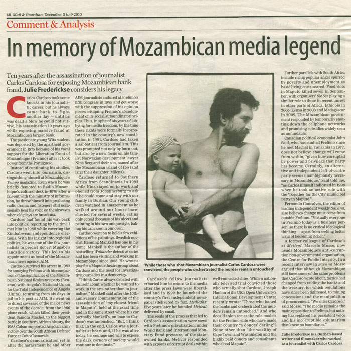
In memory of Mozambique media legend
2011 Digital print on matte paper 100 x 100cm Courtesy of Julie Frederikse |
The life story of Carlos Cardoso is symbolic of many of the significant events of our time in that region. The history of the independence of Mozambique and the workings of the new nation are all inscribed in his story. His death was symptomatic of some of the more complex problems inherent in the Mozambique nation of today, which are not that different from problems experienced by many other African countries. The lack of satisfactory resolution of the facts surrounding his assassination is unfair and unacceptable and points to a dead end in the path of hope of achieving a truly democratic and just society. Furthermore, I was drawn by Cardoso’s enthusiasm for the revolution, his inventiveness, his resourcefulness, his charisma, the complexity of his personality, his strength, his sense of ethics and, of course, his mythic or legendary status. I admire his investigative discourse and I felt it was worth dwelling on it a bit more. The installation is a homage to a person, but also a very sad work. It never ceases to amaze me that remote places on earth can produce the most creative and extraordinary human beings.
Why did you decide to incorporate the newspaper clipping which inspired the show as an object within the exhibition? Also, do you regard it as “ready-made” or rather a rendition of the original clipping?
Because I believe that subtlety and complexity lend interest and quality to an art work and intensify the meanings which one can grasp from it. I believe that Julie Fredericke’s article on Cardoso was extraordinarily well crafted in that sense. The image she chose reveals the man but does not underline his militant and political self. It rather shows a gentle, family, intimate moment. This gives a particular complexity to the understanding of the person and to his cause. I wanted to show that I had learnt that much from the image and I wanted to have it in the show that this knowledge originated in the article and it belonged to Julie. The cut-out piece of newspaper with the article became ready-made, which I used as a starting point for the work of art.
You work within a research-based practice informed mainly by cross-cultural history, politics and art. Your installation pieces are not only informed, by but also depend on, this research for a comprehensive reading of the work. How do the artworks as visual objects contribute to the conceptual content? Does the work function as an incentive to do research on the subject?
It may do that if you as a viewer are inclined to, and interested in, doing so. But I am not interested in controlling the way people read my work or in teaching people how to think about works of art. Art may be read in many different ways. I am not prescribing readings. One of the beauties of an art work lies in the potential complexity of the act of reading of visuality. This applies to all art. And no words can replace it.
 |
|
|
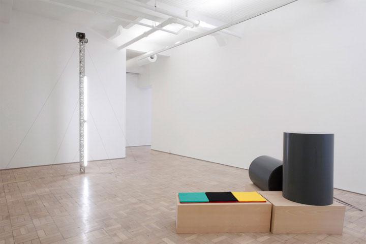
Cena Aberta and Media FAX 2 Cena Aberta MediaFAX 2 Courtesy of Galeria Filomena Soares, Lisbon |
|
 |
 |
|
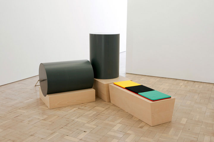
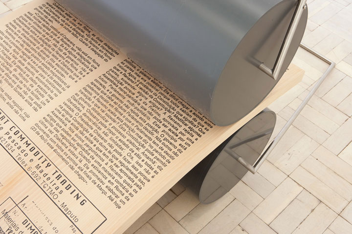
MediaFAX 2
2011 Stainless steel, PVC, laminated beech and fabric pillows 210 x 145 x 91cm Courtesy of Galeria Filomena Soares, Lisbon |
MediaFAX 5 (detail)
2011 Stainless steel, PVC and silkscreen on laminated beech 210 x 145 x 91cm Courtesy of Galeria Filomena Soares, Lisbon |
Most of the installation pieces focus on the fax machine as symbolic of Cardoso’s contributions. Could you comment on your decision to sculpturally reference the fax machine and MediaFax rather than presenting original issues of MediaFax as objects within the exhibition, like the newspaper clipping?
My practice is investigative, but my language is sculpture. I want to communicate thoughts through three-dimensional images. And I see this in the broadest possible sense. I could have chosen a path of a more archival-type show, but in my eyes the visuality of this would have been poorer. I work with the visual tools that I prefer, probably because these are the ones I am best at. And along the way I adapt them to the particular project, so not all works have photos and some are more participatory than others, etc. In this case sculpture seemed the “right” language to dwell conceptually on the form and role of the fax machine. It’s really hard to make good art, so one should always do what one is best at.
 |
 |
|
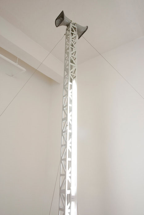
Cena Aberta
2011 Anodized aluminium, steel cables, fluorescent lights, megaphones Sound, 52 min loop; radio plays O Ritual by Carlos Coutino and O Negreiro by Santana Agonso; courtesy of Mozambique Radio 370 x 11.5 x 11.5cm Courtesy of Galeria Filomena Soares, Lisbon |
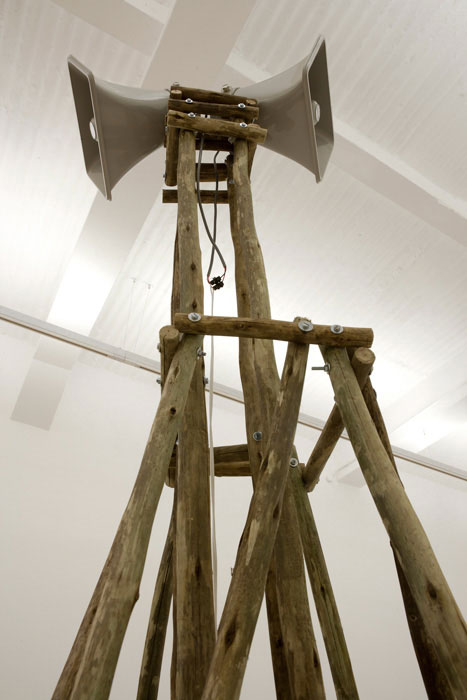
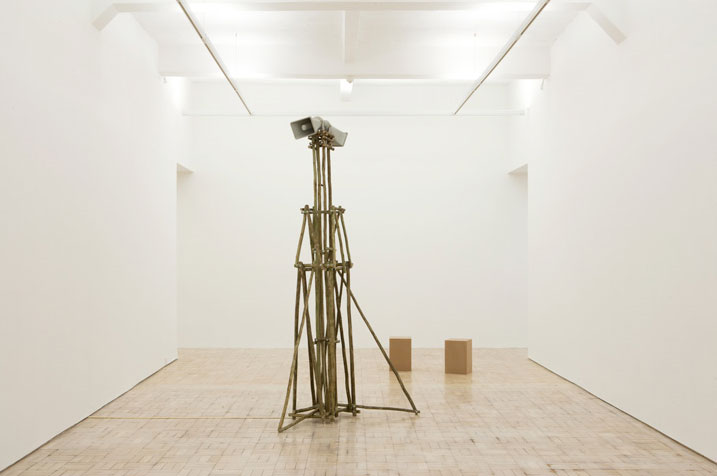
Kaapse Sonnette/Cape Sonnets
(Gum thatching lathes) 2011 Gum thatching lathes, screws, megaphones, sound system Sound, 12 min loop; Afrikaans and English versions of Peter Blum's 6 Kaapse Sonnette published in Blum's Steenbok tot Poolsee (Nationale Boekhandel, 1955). English translation: Marji Geldenhuys. Readers: Basil Appollis (Afrikaans), Marji Geldenhuys (English) 300 x 153 174cm |
In both Cena Aberta and Kaapse Sonnette/Cape Sonnets the radio tower becomes a prominent element. Referencing the structure of a broadcast tower as erected in Mozambique in the 1970s, one would expect the voices to echo loudly through the gallery space. However, the voices are presented as faint murmurs, requiring the viewer to listen intently. What is the significance of presenting the sound as an almost indistinct element in the work?
Something about the poor sound quality of these megaphones enables the experience of the voices to be ghostly.
 |
|
Kaapse Sonnette/Cape Sonnets
(Gum thatching lathes) 2011 Gum thatching lathes, screws, megaphones, sound system Sound, 12 min loop; Afrikaans and English versions of Peter Blum's 6 Kaapse Sonnette published in Blum's Steenbok tot Poolsee (Nationale Boekhandel, 1955). English translation: Marji Geldenhuys. Readers: Basil Appollis (Afrikaans), Marji Geldenhuys (English) 300 x 153 174cm |
Confronted with the futuristic, industrial quality of Cena Aberta I couldn’t help recalling Dan Flavin’s work. Kaapse Sonnette/Cape Sonnets, on the other hand, bears a resemblance to Tatlin’s Tower. What is contributed and revealed about your work through these references in terms of ideological conflicts?
My favourite work by Dan Flavin is the series in which he pays homage to Tatlin ... I have referenced these sources very often. Modernism has been the operative language of my practice and it is possible that this can be confused with a celebratory and inspirational reference. But in fact much of its autocratic imposition on everything and everybody around it poses huge problems and is even offensive. So sometimes it has been the source of subtle criticism on my part. I mention works like In Double Sided (1995-1997). But I try not to generalise. The master narrative was imposing, but many individuals often weren’t, and we need to differentiate between things. In this regard the case of Flavin is special. His was a unique practice. The works are often humble and raw. What I find interesting is that he understood the hugeness of Tatlin’s Tower projects. I like to read this understanding as having political content. Also, he hinted at the fact that towers are very symbolic and important markers in landscape and in history. Flavin was a minimalist in the best sense: his work was minimal but not ostentatious.
- Visit Stevenson’s website here.
- Images: Courtesy of Stevenson, Cape Town and Johannesburg